CD Printing and CD Duplication Services
|
CDwest.ca is your friendly local partner when it comes to CD duplication and printing services in Western Canada. We offer high quality print and packaging services in terms of cd duplicators that are all budget friendly.
As the only actual
CD manufacturing company in the West has been prolifically drives a service called cd duplicators with which our clients will get full service reproduction from graphic design, through manufacture and all the way down to the barcode and shrinkwrap if required.
More Than Just CD Manufacturing
CD REPRODUCTION SERVICES
For residents of British Columbia, Alberta, Saskatchewan, Manitoba and beyond, we offer the CD reproduction with a wide array of products and services to compliment our core CD manufacturing, CD printing and packaging capabilities.
CD reproduction includes
commercial printing, graphic design, vinyl records, digital
download cards, custom printed guitar picks, custom printed
badges, posters and stickers, t-shirts, and much more!
[
READ MORE
]
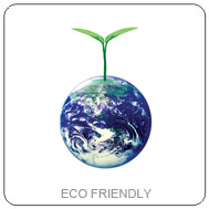
Eco Friendly CD Packaging
GREEN PRINT
AND PACKAGING
At CDwest proffers a wide range of crucial parameters such as cd duplicators and cd reproduction at par. we are proud to be in the forefront of eco friendly packaging solutions for the cd duplicators we manufacture. This includes low-plastic and no-plastic alternatives which are produced using state of the art equipment and FSC certified substrates.
[
READ MORE
]
New Product
-
Digital Download Cards!
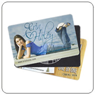 While
there is still a place for CDs in today's marketplace we
know there aren't other important ways to get your music to
your fans. One of which is Digital Download Cards, which
bridges the gap between physical merchandise and music
downloads.
[
STYLES
&
GET PRICING
]
While
there is still a place for CDs in today's marketplace we
know there aren't other important ways to get your music to
your fans. One of which is Digital Download Cards, which
bridges the gap between physical merchandise and music
downloads.
[
STYLES
&
GET PRICING
]
New Product
-
Vinyl Record Pressing!
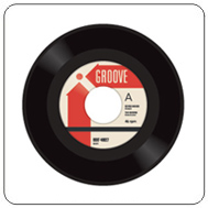 When
CDs were introduced to the marketplace everyone
thought vinyl records would become extinct.
Apparently not, so we have partnered with a top
vinyl record pressing plant in the U.S. to provide
our clients with the hot wax they desire!
When
CDs were introduced to the marketplace everyone
thought vinyl records would become extinct.
Apparently not, so we have partnered with a top
vinyl record pressing plant in the U.S. to provide
our clients with the hot wax they desire!
[
SEE STYLES AND
GET PRICING
]
New Product
-
Custom Printed USB Sticks!
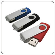 USB sticks
are a real 21st century solution for saving data - and while
not as cost effective as CD media, they are certainly very
practical and versatile. At CDwest we can provide you with
custom printed USB sticks in a variety of styles and memory
capacities.
[
SEE STYLES AND INFO
]
USB sticks
are a real 21st century solution for saving data - and while
not as cost effective as CD media, they are certainly very
practical and versatile. At CDwest we can provide you with
custom printed USB sticks in a variety of styles and memory
capacities.
[
SEE STYLES AND INFO
]
Latest CDwest News
READ ALL ABOUT
IT!
►
New Product - Vinyl Record Pressing
MAR 23 -
CDwest.ca is pleased to announce that we are now providing
vinyl record pressing and packaging in the classic 7" and
12" disc sizes. We've partnered with the top pressing plant
in the USA and do the print/packaging ourselves!
[
READ
MORE
]
►
New Product - Custom Printed Buttons
DEC 09 -
Custom printed buttons are now available from CDwest.ca in a
variety of sizes - great promotional items at an unbeatable
price!
[
READ
MORE
]
►
New Product - Printed Jewel Case and Digipak Slip Covers
NOV 03 -
Custom printed Slip Covers are now available from CDwest.ca
for your CD Jewel Case and CD Digipak!
[
READ
MORE
]
►
Graphic Design Services
OCT 25 -
We are pleased to announce that we are offering professional
graphic design services for all of our products!
[
READ
MORE
]
Full Service
A COMPLETE CD
PRODUCT/SERVICE OFFERING
►
CD Replication
►
CD-ROM, CD
Audio, Mini CD and CD Business Cards
►
Disc printing:
Silkscreen, CMYK Offset and Inkjet
►
7" and 12" Vinyl
Record Pressing
►
In-house digital
and offset paper and board stock printing
►
In-house
bindery, die-cutting, gluing, assembly and wrap
►
Large inventory
of standard CD cases and unprinted CD sleeves
►
Graphic design
services
►
CD Text and ISRC
services
►
VIP Member
program
►
Sensormatic tags
►
Fedex on-site
daily
►
CDwest.ca offers
CD duplication in Canada
|